03

AlgoLink

03

AlgoLink

03

AlgoLink

Role:

Product Design Intern

User Flow

Journey Mapping

Prototyping

Team:

Consumer Platform

Team 6

Timeline:

May 2024 - October 2024

Overview

AlgoLink is a startup bridging education and recruitment by providing learners with tailored courses and connecting them with recruiters. My role in this project was to redesign the consumer platform, focusing on key areas: course pages, the test center, the landing page, and the company’s logo.

Problem

AlgoLink’s platform worked but lacked a cohesive user experience to support its goals. The course pages were cluttered and not engaging, there was no test center, and the branding didn’t reflect the company’s mission. This hurt user engagement and brand recognition—key areas for a growing startup.

Solution

I addressed these challenges by redesigning the Course Pages into a streamlined dashboard for easier navigation and engagement. I conceptualized and built a new Test Center to assess learning progress. Additionally, I designed a fresh logo to better align with AlgoLink’s mission and kicked off a landing page redesign to highlight the platform’s offerings.

User Feedback - Part I

While full user testing is pending, internal feedback from design interns and collaborators pointed to areas needing improvement.

POV Analysis

POV Analysis

Simplified User Journey Map

The graph shows the emotional ups and downs of travel planning. Inspiration and exploration bring excitement, but stress from budgeting and planning creates challenges. Our device starts helping at the first dotted line and offers the most support by the second, reducing stress and improving the travel planning experience.

Analysis

User feedback highlighted the need to balance personalized recommendations with intuitive simplicity. To address this, we refined icons, streamlined interactions, and integrated a voice assistant that offers natural, engaging support. This approach ensures easy navigation while providing tailored options, enhancing user satisfaction and reducing stress.

Ideating Solutions

I explored various design strategies on paper and on Figma to close the gaps identified:

Initial Prototypes

Chat Screen ver.1

Chat Screen ver.2

Explore Page

Itinerary Page

Initial Prototypes

Chat Screen ver.1

Chat Screen ver.2

Explore Page

Itinerary Page

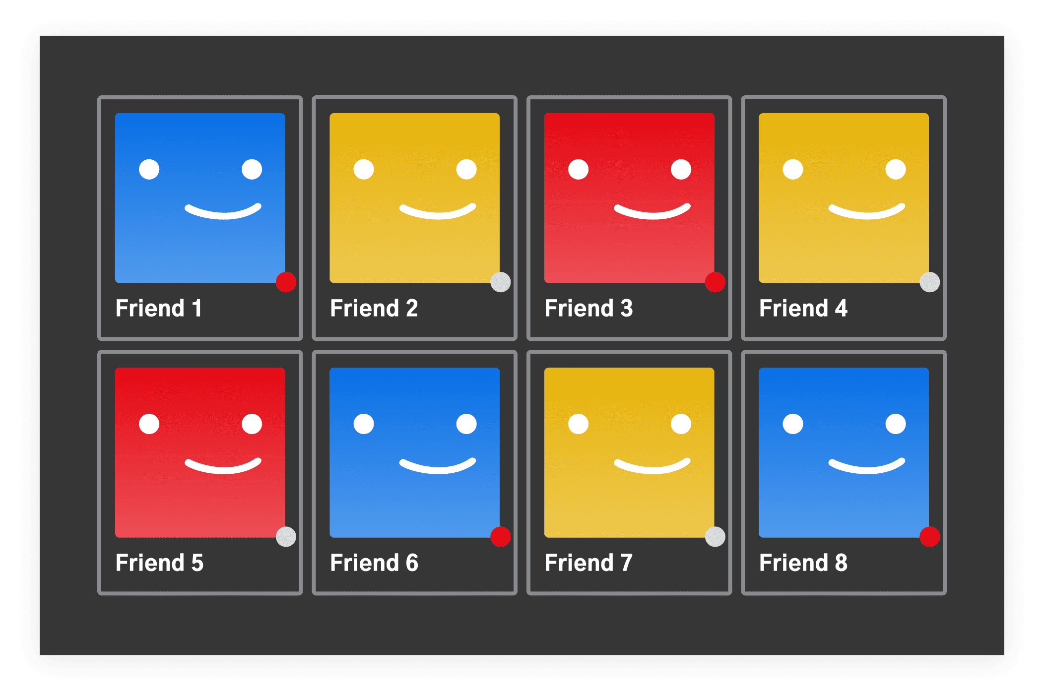
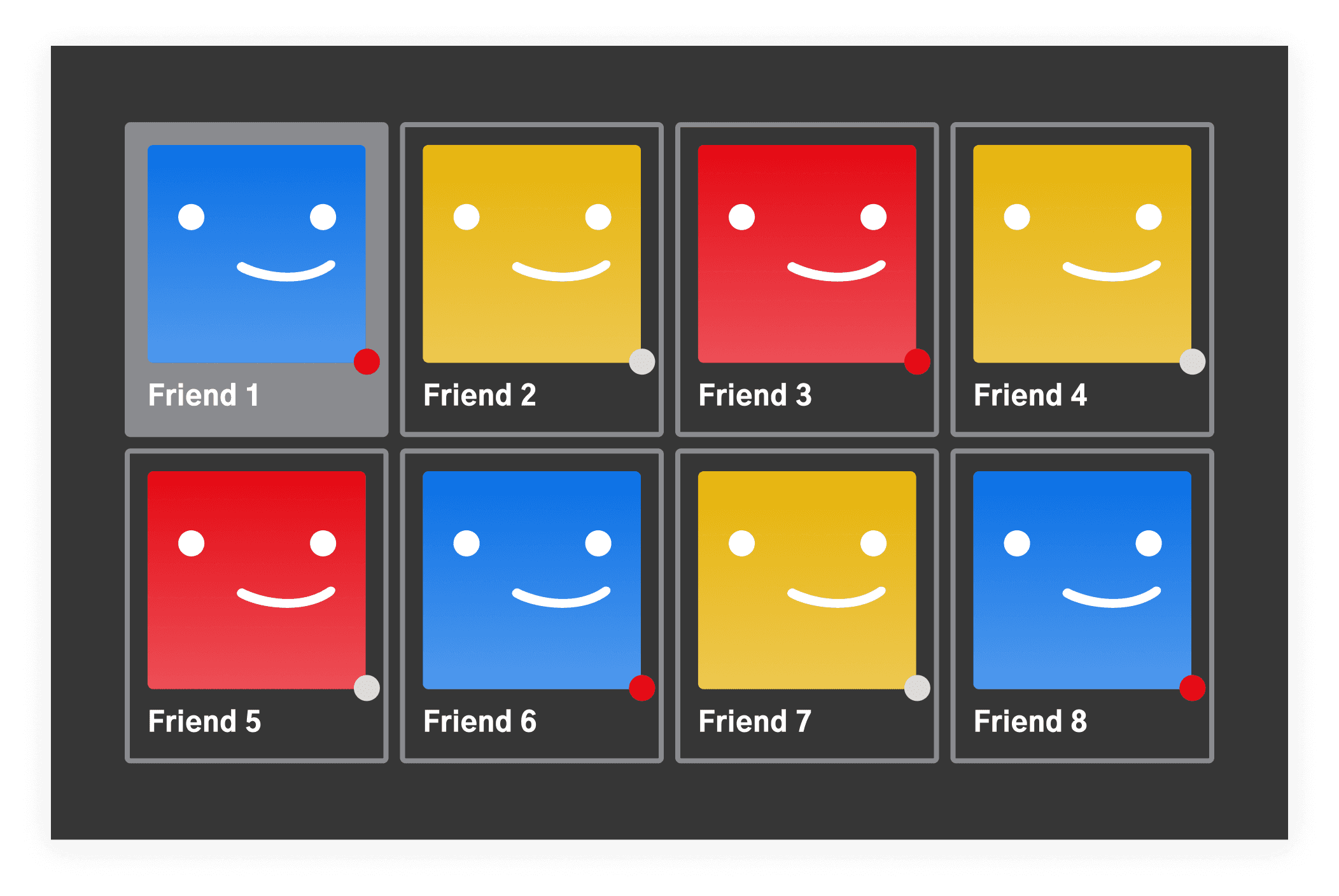
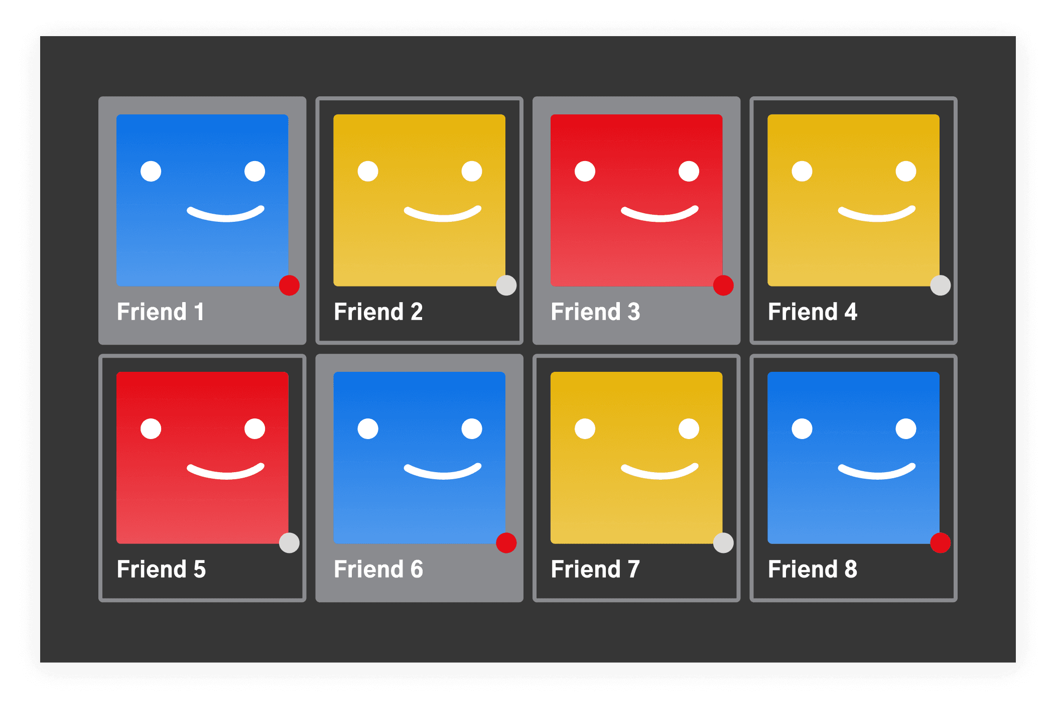
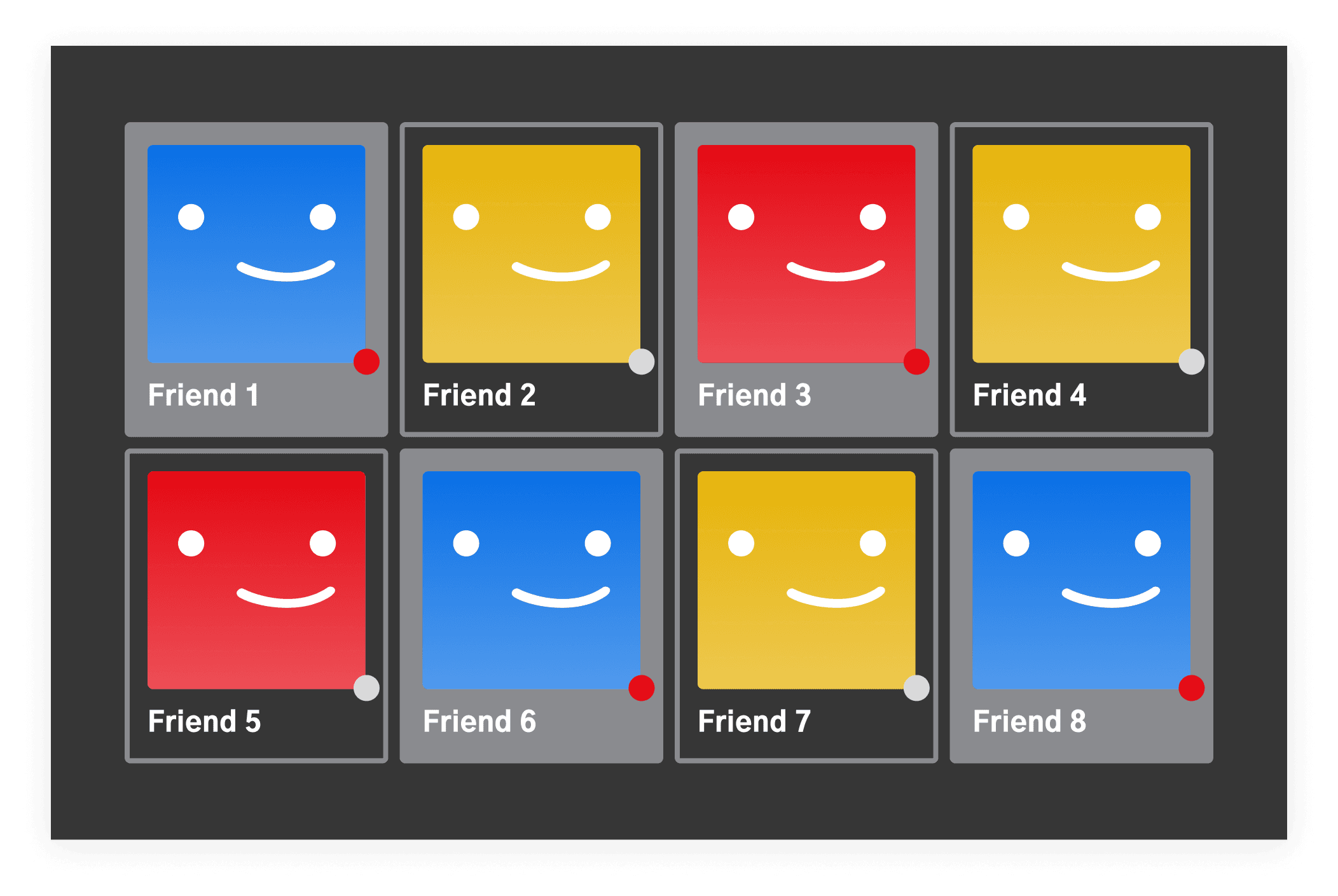
User Feedback - Part II

During four rounds of feedback, users tested the initial prototype and provided critical insights after each iteration. Their feedback helped refine the design and address key areas for improvement:

  • Clearer Features: Simplified design elements made key features more understandable.

  • Consistency Matters: Consistent labeling and design patterns reduced confusion and improved the user experience.

  • Voice Assistant: Users valued the voice assistant for its ability to provide personalized recommendations and reduce stress during planning.

Each round of feedback guided iterative improvements, ensuring the final design fully aligned with user expectations.

The Final Design

After continuous iterations, I decided on these final designs:

Chat Screen ver.1:

Engages users through a virtual assistant with voice input, featuring a waveform for a more interactive experience.

Explore Page:

Users can select interests to receive customized recommendations, with virtual assistant guidance available.

Chat Screen ver.2:

Enhanced chat design with text input options and a prominent "Build Your Trip" button, allowing users to plan directly from the chat.

Itinerary Page:

Provides users with a detailed, personalized trip plan and suggested nearby attractions based on preferences.

Chat Screen ver.1:

Engages users through a virtual assistant with voice input, featuring a waveform for a more interactive experience.

Chat Screen ver.2:

Enhanced chat design with text input options and a prominent "Build Your Trip" button, allowing users to plan directly from the chat.

Explore Page:

Users can select interests to receive customized recommendations, with virtual assistant guidance available.

Itinerary Page:

Provides users with a detailed, personalized trip plan and suggested nearby attractions based on preferences.

Explore Page:

Users can select interests to receive customized recommendations, with virtual assistant guidance available.

Chat Screen ver.1:

Engages users through a virtual assistant with voice input, featuring a waveform for a more interactive experience.

Chat Screen ver.2:

Enhanced chat design with text input options and a prominent "Build Your Trip" button, allowing users to plan directly from the chat.

Itinerary Page:

Provides users with a detailed, personalized trip plan and suggested nearby attractions based on preferences.

Conclusion

The platform needed to offer more than courses; it required an engaging, interactive learning experience. A robust Test Center and an intuitive dashboard would improve learning outcomes and user retention. A stronger brand identity was also essential for credibility and growth.

Reflection + Future Trajectory

This project taught me to balance design aesthetics with business needs, especially in a fast-paced startup environment. Moving forward, I see opportunities to refine the platform further by incorporating user feedback and expanding features, keeping the focus on user-centric design to drive long-term growth.