01

Algoinvest

01

Algoinvest

01

Algoinvest

Role:

Product Design Consultant

Team:

Medium Design Collective - Praxis Subteam

Timeline:

September 2024 - Present

Overview

AlgoInvest is an investment platform designed to simplify investing for everyone, including those with no financial background. It automates the process through two core funds: the Core Fund for passive strategies and the AI Fund for active strategies. These funds provide access to diverse asset classes like equities, real estate, and commodities, making high-quality investments accessible to all.

My role involved designing a professional logo, streamlining navigation, and transforming the complex Portfolio and Performance pages into a single, user-friendly Explore page to enhance accessibility and usability.

Problem

The original design made investing feel overwhelming and inaccessible:

  • The Portfolio page’s fragmented flowchart confused users, especially those with limited financial knowledge.

  • The Performance page presented detailed metrics without context, leading to cognitive overload.

  • Redundant content and unclear navigation further hindered the user experience.

These issues prevented AlgoInvest from fulfilling its mission of effortless investing for all.

Solution

I restructured the platform’s navigation to improve usability by consolidating the Portfolio and Performance pages into a single Explore page. This intuitive flowchart simplifies complex fund and performance data, making it more accessible to all users.

Additionally, I designed the AlgoInvest logo, which visually encapsulates the platform’s mission and values. The updated navigation aligns with this new structure, ensuring seamless access to essential areas such as the Dashboard, Explore, Funds, and Philosophy, creating a cohesive and efficient user journey.

User Feedback/Analysis

User Feedback/Analysis

User Feedback/Analysis

Since the platform has not yet launched, the feedback I have gathered so far comes from internal evaluations within our design team. Key insights include:

  • Navigation Issues: The transition between the previous Portfolio and Performance pages was disjointed, with the fragmented flowchart on the Portfolio page creating an unclear user journey. There is a need for a more cohesive navigation structure across the entire website.

  • Information Overload: Excessive, unstructured data in fund and performance metrics overwhelmed users, highlighting the need for clearer content prioritization.

  • Branding Gaps: Inconsistencies in design elements undermined credibility, emphasizing the importance of cohesive branding.

  • Branding: Inconsistent branding weakened user trust and recognition.

  • Branding: Inconsistent branding weakened user trust and recognition.

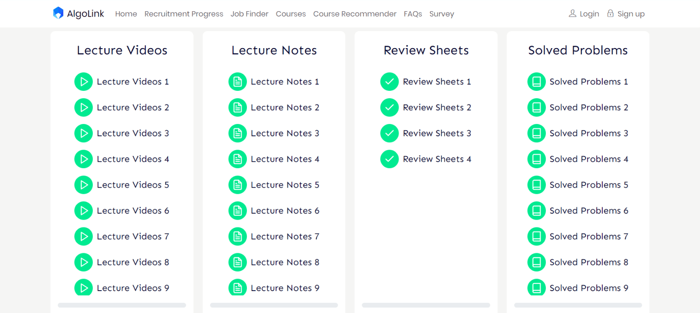
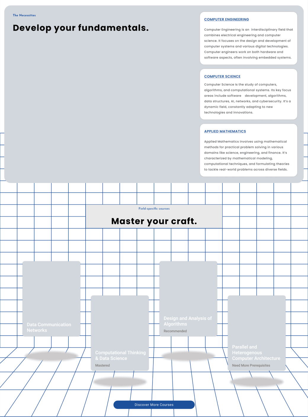
  • Course Flow: Overcomplicated structure made learning difficult.

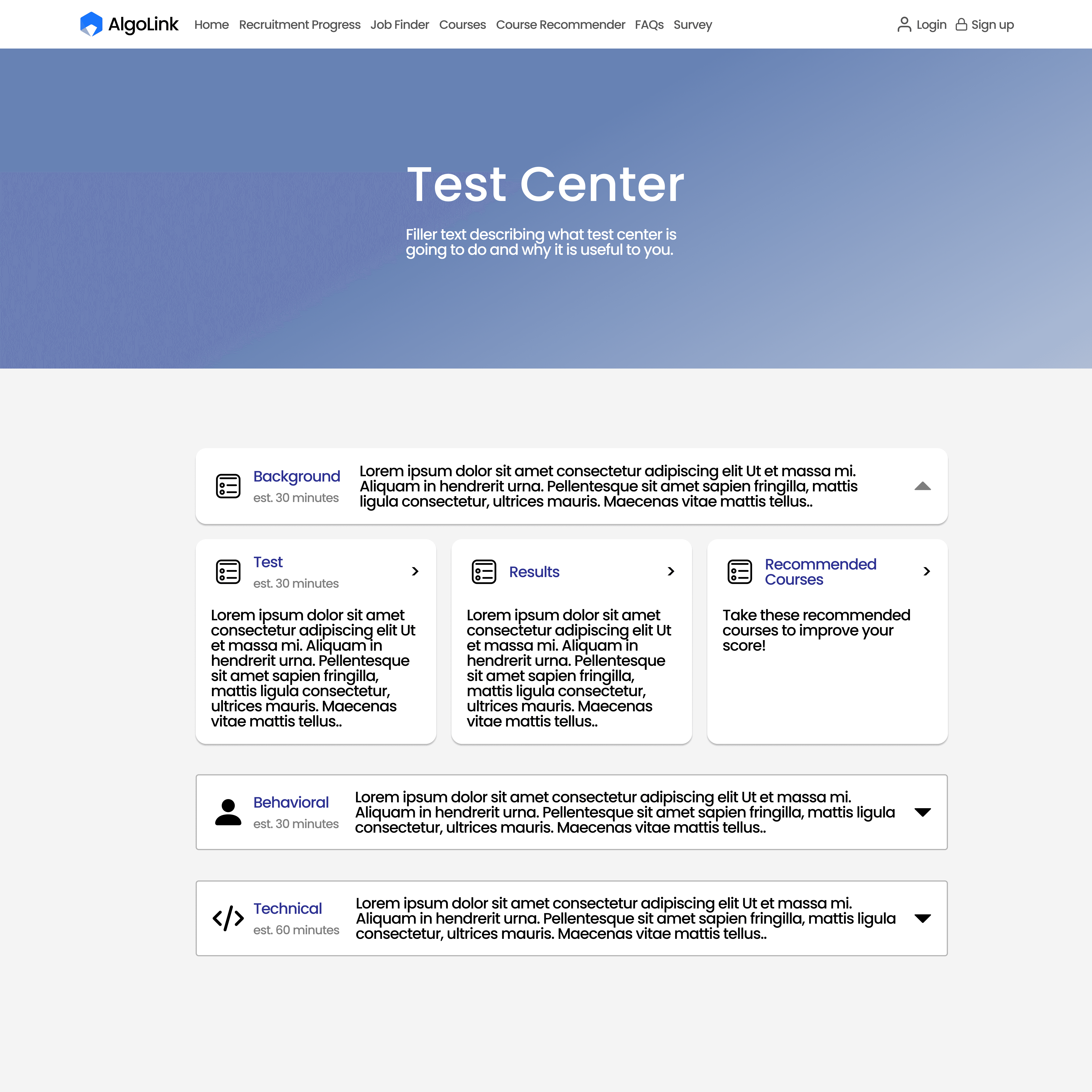
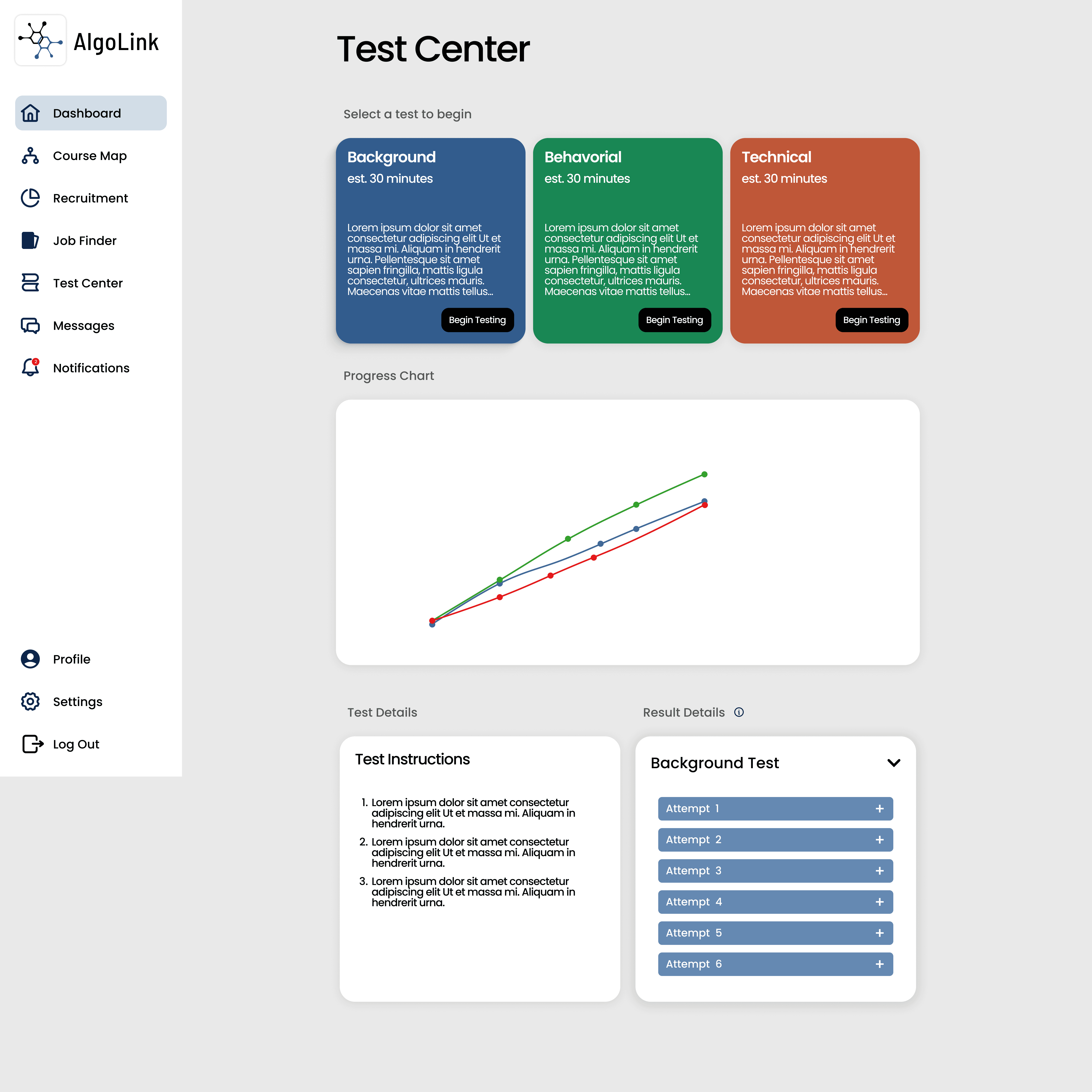
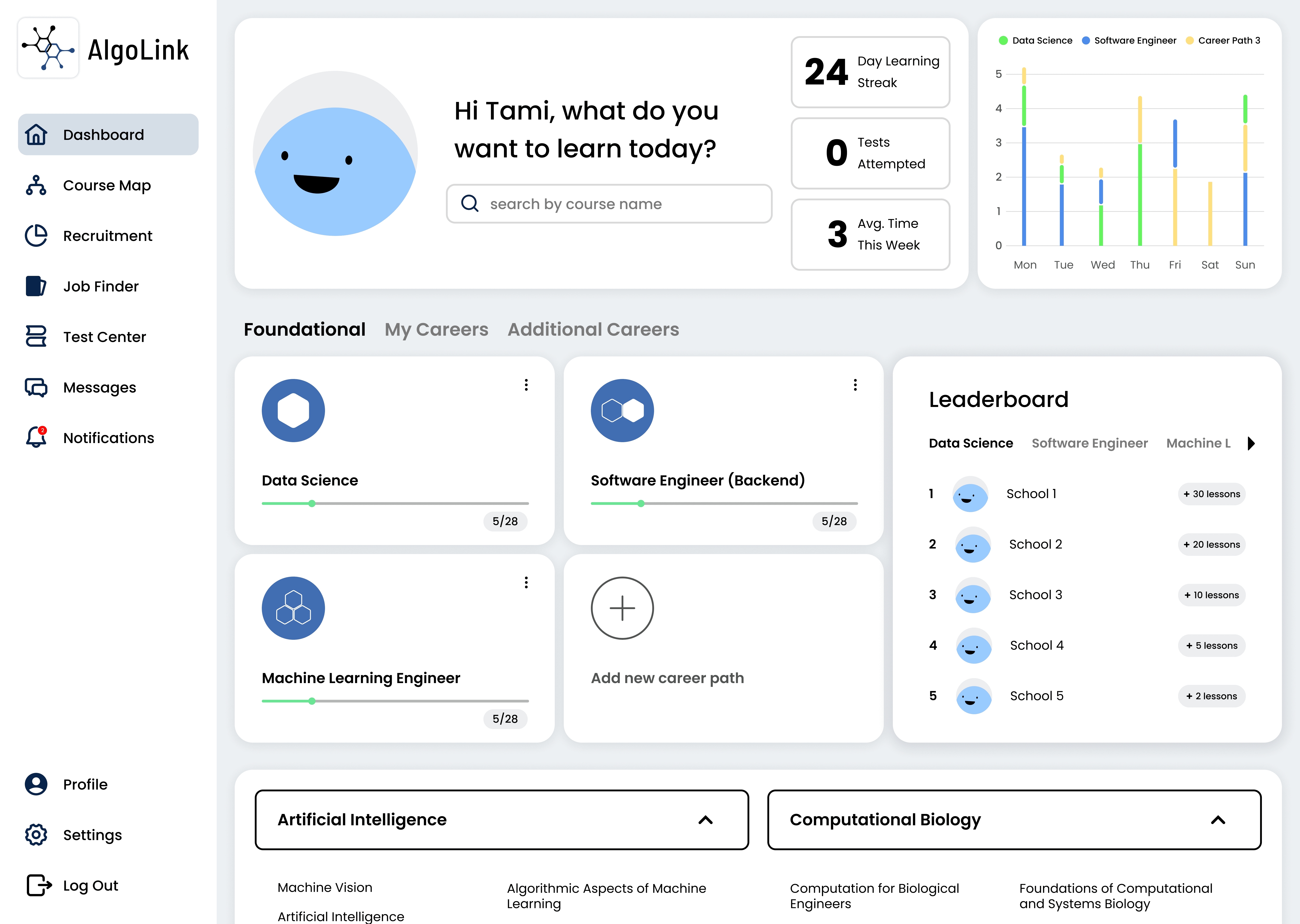
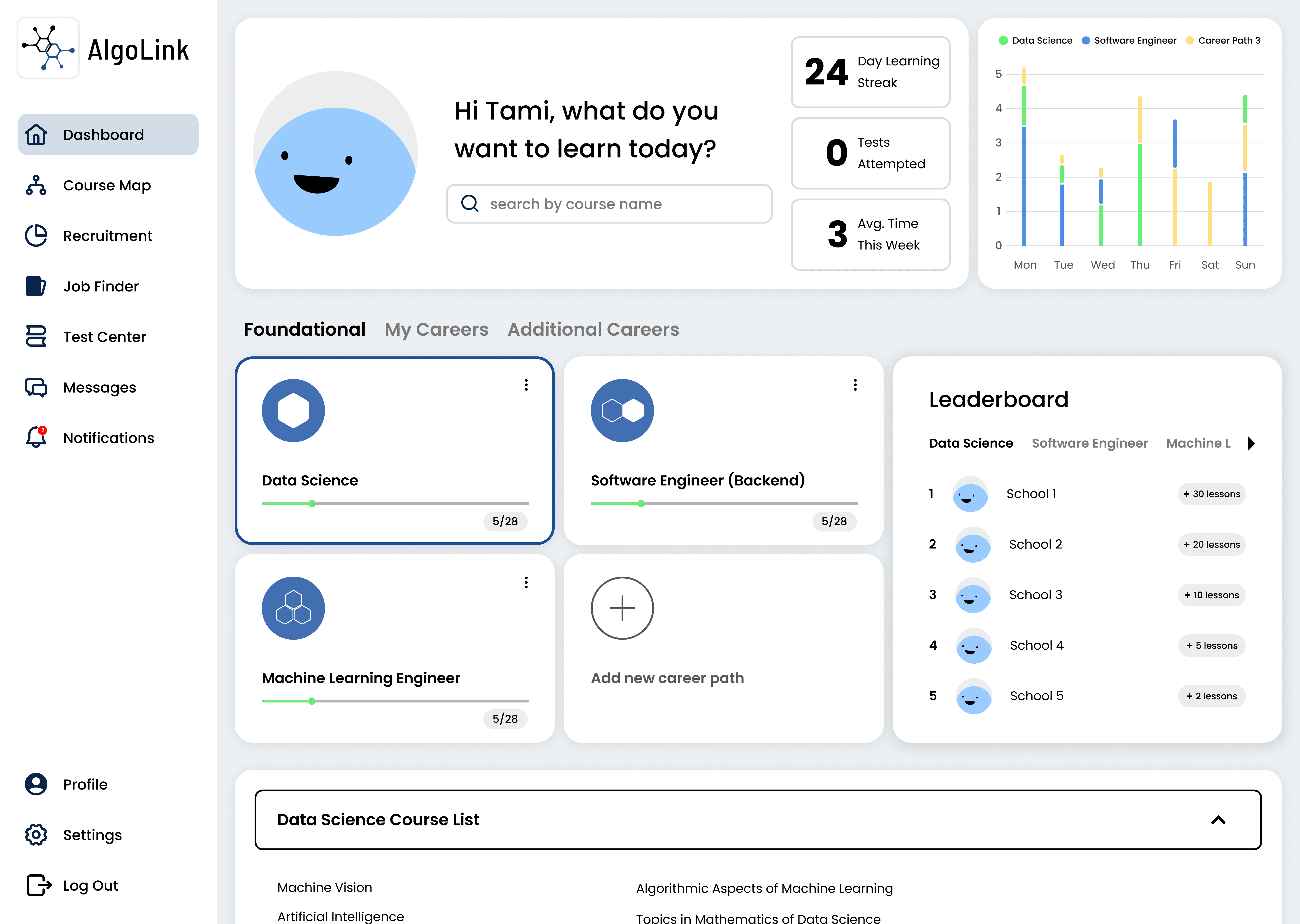
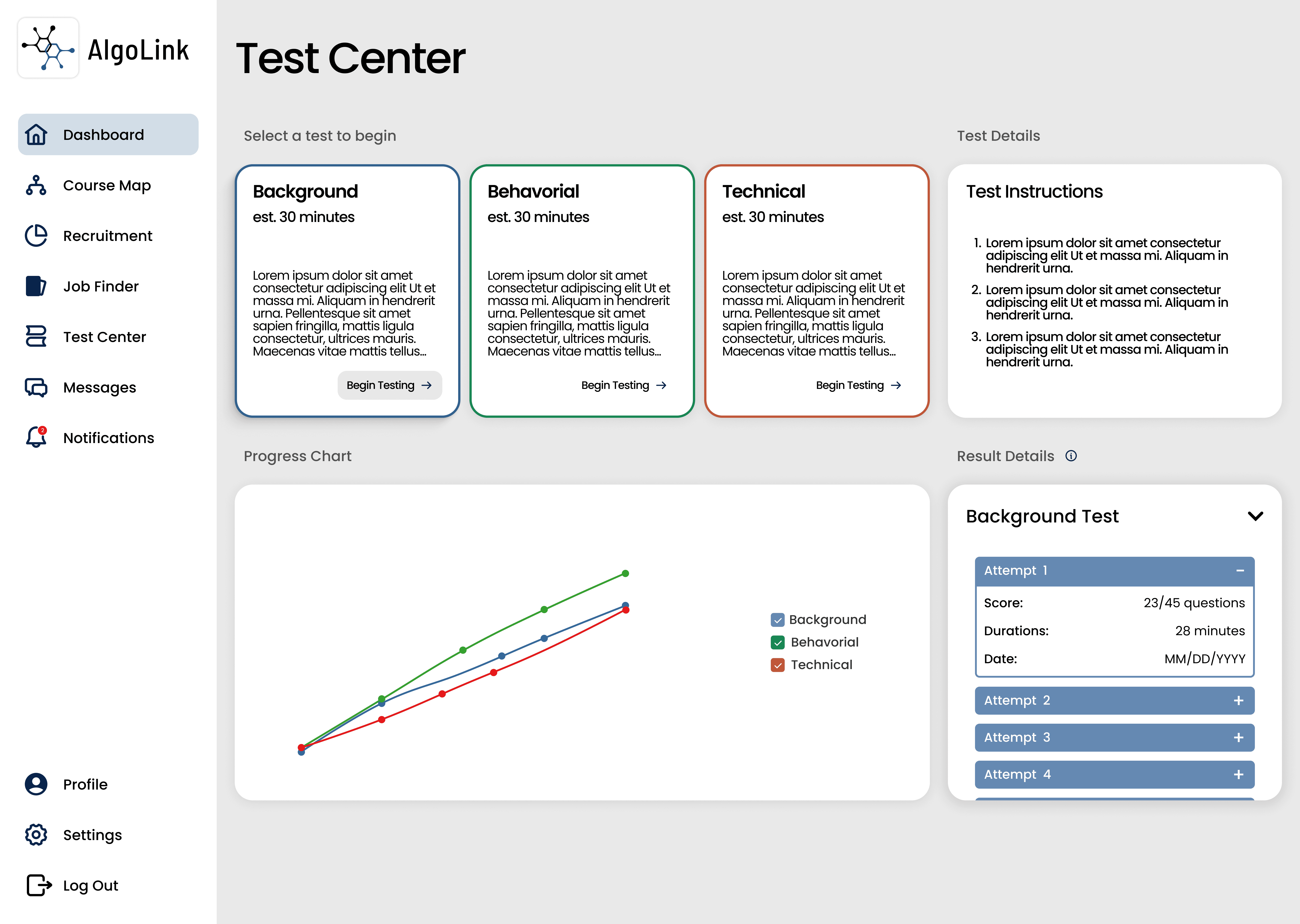
  • Test Center: Its absence left users unable to gauge their progress.

Insight

This redesign reflects AlgoInvest’s mission to make ETF management straightforward and accessible. By combining and improving existing features, the Explore page positions AlgoInvest as a trusted tool for users seeking clarity in financial decision-making.

Ideating Solutions

Ideating Solutions

Current high-fidelity designs include:

  • Explore Page: A consolidated flowchart that simplifies fund relationships and performance metrics, offering both overview and detailed insights within a single framework.

  • Navigation Simplification: Improved page hierarchy for smoother user journeys.

  • Visual Enhancements: Clean, professional layouts with refined typography and color schemes to enhance readability and trust.

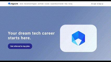
  • Logo: Feedback from managers guided the logo redesign to better reflect AlgoLink’s values and mission.

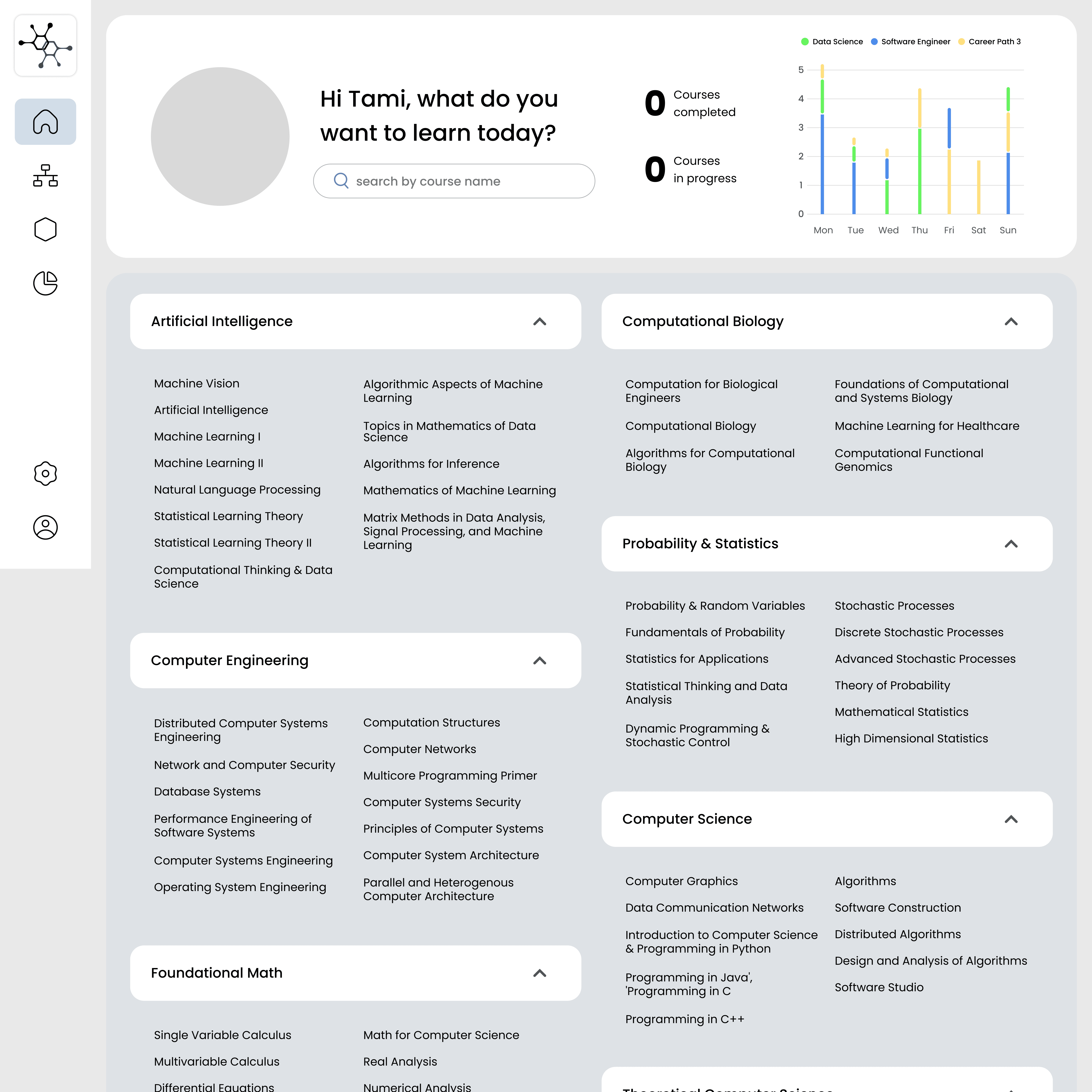
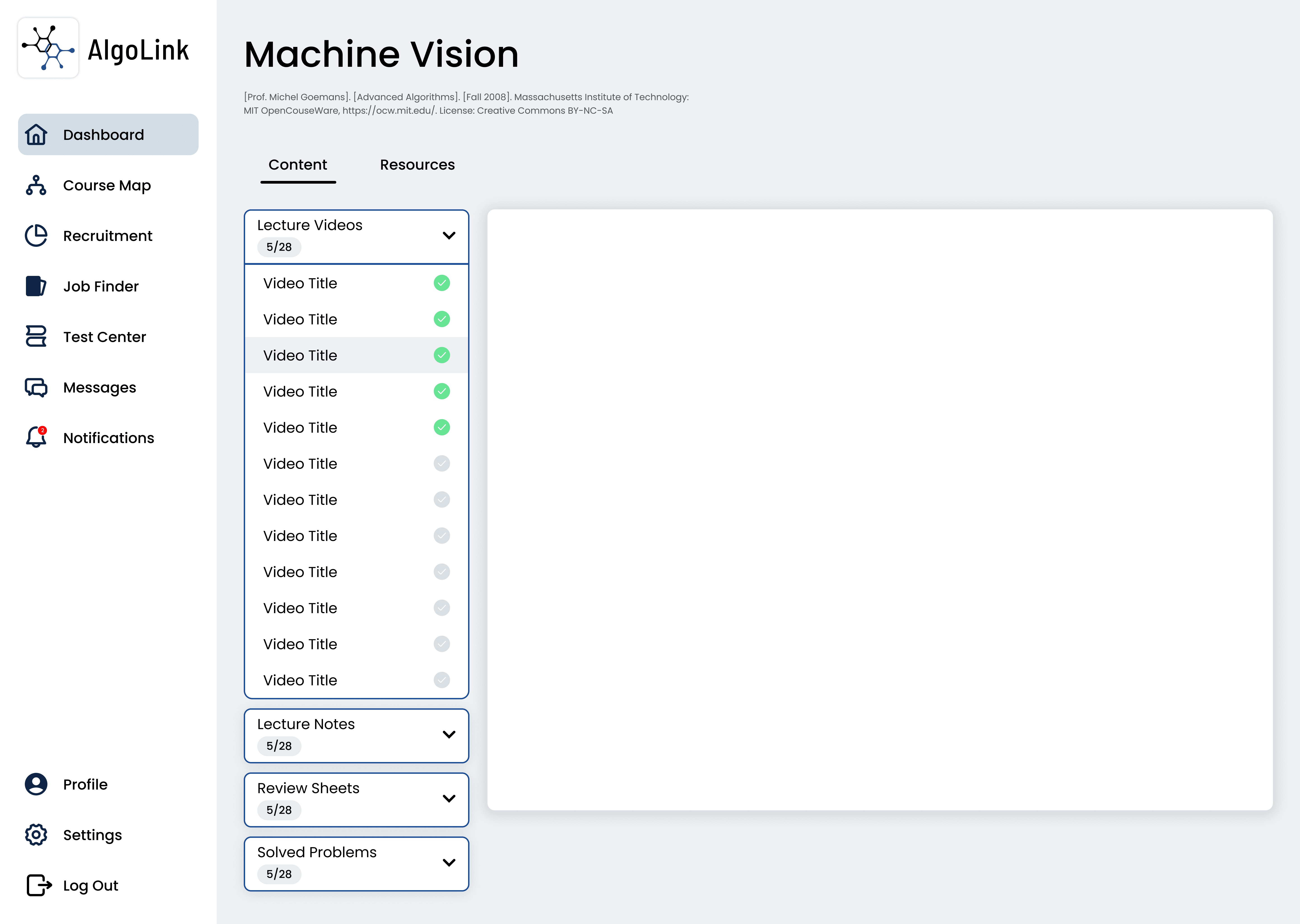
  • Course Dashboard: I brainstormed layouts and researched best practices in existing course platforms.

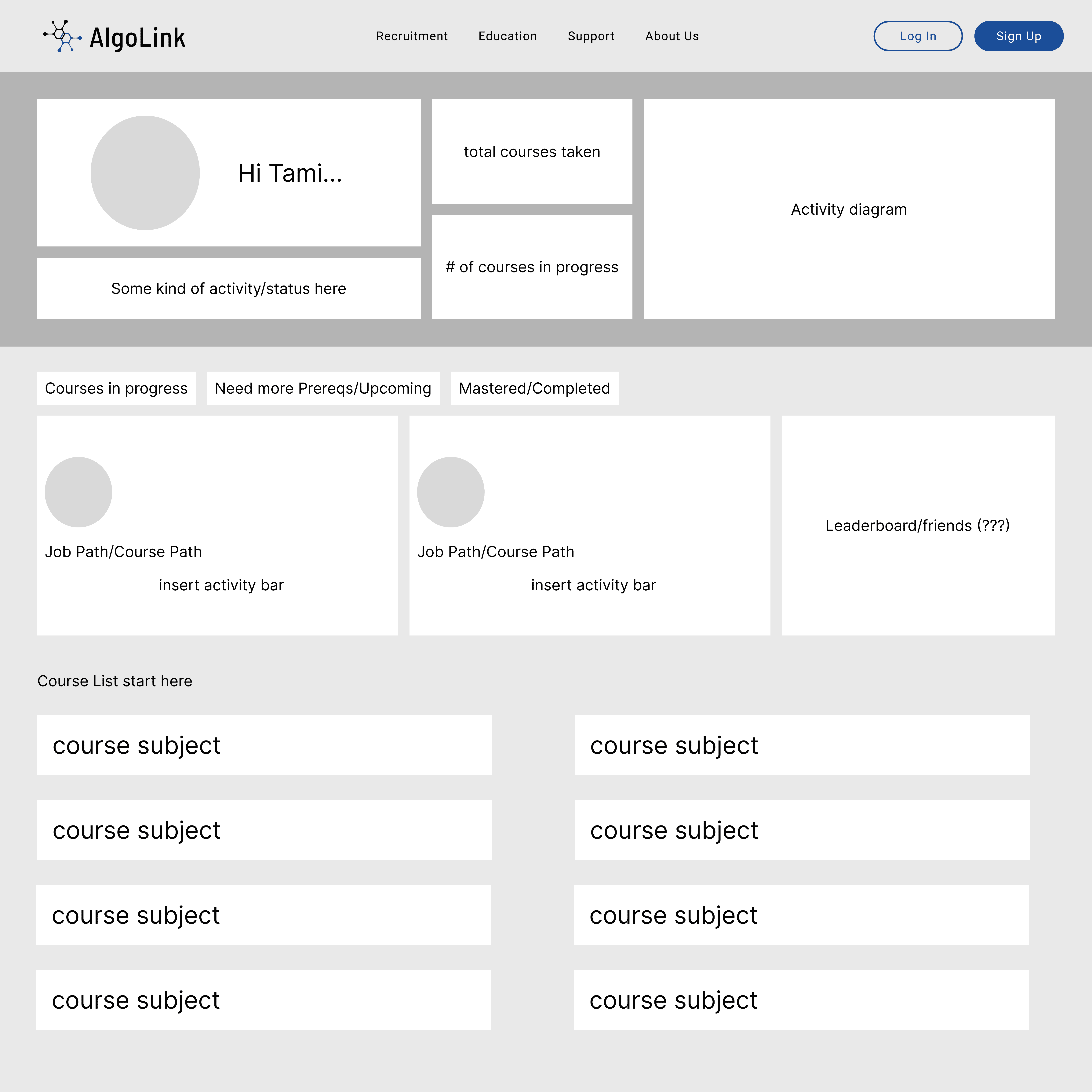
  • Test Center: I sketched initial ideas and tested flows to ensure ease of use.

The Final Design

The Final Design

Enhanced Explore Page

The final design unifies the Portfolio and Performance pages into a centralized Explore hub, creating a seamless experience for users. By streamlining navigation and focusing on interactive data visualizations, the redesign makes fund performance and diversification metrics more accessible.

  • Logo: A refreshed visual identity that represents AlgoLink’s mission.

  • Landing Page: Redesigned to communicate the platform’s offerings clearly and convert visitors into users (content still in progress).

  • Course Dashboard: A centralized hub where users can track progress and manage their courses.

  • Course + Lessons Page:

Cleaner layout and enhanced navigation to create an intuitive learning path.

  • Test Center:

New feature offering skill exams to showcase user expertise to recruiters.

The Final Design

Enhanced Explore Page

The final design unifies the Portfolio and Performance pages into a centralized Explore hub, creating a seamless experience for users. By streamlining navigation and focusing on interactive data visualizations, the redesign makes fund performance and diversification metrics more accessible.

  • Logo: A refreshed visual identity that represents AlgoLink’s mission.

  • Landing Page: Redesigned to communicate the platform’s offerings clearly and convert visitors into users (content still in progress).

Landing Page (Slides 1-2)

Landing Page (Slides 3-4)

Landing Page (Slides 4-5)

  • Course Dashboard: A centralized hub where users can track progress and manage their courses.

  • Course + Lessons Page:

Cleaner layout and enhanced navigation to create an intuitive learning path.

  • Test Center:

New feature allowing users to take exams and quizzes, preparing them for real-world job applications.

New feature offering skill exams to showcase user expertise to recruiters.

Conclusion

This redesign reflects AlgoInvest’s mission to make ETF management straightforward and accessible. By combining and improving existing features, the Explore page positions AlgoInvest as a trusted tool for users seeking clarity in financial decision-making.

Reflection + Future Trajectory

This project helped me improve my skills in iterative design and balancing complexity with a clear user experience. Working with a team with limited finance knowledge challenged me to adapt and think creatively. Moving forward, I will continue iterating on the Explore page based on usability testing and focus on improving other areas of the platform to enhance the overall user experience.